Portfolio case studies
video, graphic design, and ANIMATION
This page highlights selected projects that demonstrate my creative direction process across video and design. Each case study outlines the challenge, strategic approach, execution, and measurable impact, offering insight into how I translate complex ideas into cohesive, brand-aligned work.
Video: Case Study #1
Client: Montgomery County Public Schools, BTheOne, KnowTheRisks
Agency: Comcast - Mnemonic Agency (Effectv)
Role: Director and Producer
Project type: PSA (15-sec, 30-sec)
Challenge
Montgomery County Public Schools sought to address rising concerns around suicide and substance abuse among adolescents in the Poolesville area in the state of Maryland. They wanted to do a PSA campaign that would resonate with both students, parents, and guardians. The messaging needed to be emotionally compelling while remaining responsible, age-appropriate, and aligned with district and stakeholder expectations.
Strategy
The campaign centered on authentic, relatable storytelling that reflected real-world pressures faced by teens. The creative approach prioritized empathy over fear-based messaging, using cinematic framing and intentional pacing to build credibility and emotional connection. Messaging was developed to work across 15- and 30-second formats while maintaining clarity and impact.
Execution
As Creative Lead on the project, I was responsible for market research (e.g. focus group, data insights), concept development, budgeting, pitching creative concepts to the client, casting, visual tone, on-set direction, and final delivery. I collaborated closely with agency partners and stakeholders to ensure alignment with campaign objectives while maintaining narrative integrity. Final deliverables were optimized for linear (broadcast) and non-linear (digital) distribution.
Impact
The PSA contributed to a broader awareness initiative aimed at prevention and community engagement. The campaign received strong stakeholder response and a regional Emmy nomination.
Video: Case Study #2
Client: GRS Technology Solutions
Role: Creative Director and Producer
Project: “The Ransomware Attack”
Challenge
GRS Technology Solutions was experiencing a decline in new business and needed a more effective way to communicate the urgency and value of their cybersecurity services. A previous marketing video had failed to drive growth, and leadership sought a fresh, differentiated approach that would resonate with executive decision-makers responsible for enterprise network security.
Strategy
Rather than producing a traditional corporate explainer, I positioned the project as a cinematic branded short film designed to mirror the tone of a television episode teaser. The goal was to create narrative tension that reflected real-world cybersecurity threats while clearly illustrating the consequences of inaction. The creative approach balanced storytelling with strategic messaging tailored to executive audiences.
Execution
As Creative Director and Producer, I led market research, concept development, budgeting, and client pitching. I directed casting, visual tone, and on-set production while collaborating closely with the CMO, founder, and technical experts to ensure clarity and accuracy of messaging. Final deliverables were optimized for YouTube and digital distribution.
Impact
The film generated over 1,000 views within the first hour of release and contributed to increased revenue for the client. It went on to receive multiple industry recognitions, including two Telly Awards and a Davey Award, and has since reached nearly 100,000 views.
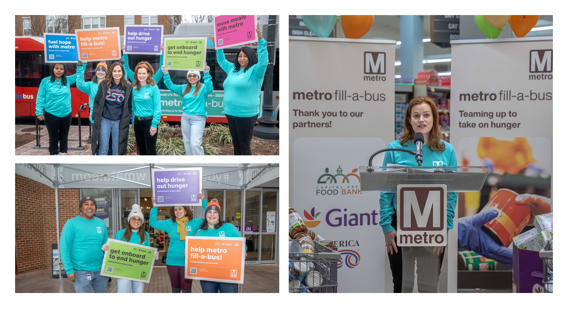
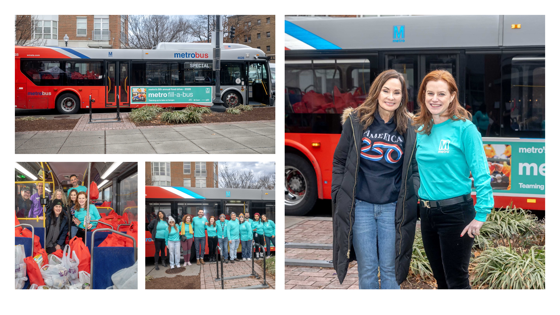
Graphic Design - Campaign & Event: Case Study #1
Company: Metro/WMATA
Campaign & Event: Fill-A-Bus
Role: Graphic Design Lead
Challenge
Metro’s annual Fill-A-Bus campaign required a refreshed visual identity aligned with newly established brand guidelines. Previous executions lacked visual consistency, and the campaign included multiple external partners such as Giant, America 250, and Capital Area Food Bank. The creative needed to unify partner branding while maintaining clarity, cohesion, and visibility across a wide range of physical and digital touchpoints.
Strategy
I developed a cohesive visual system anchored in Metro’s updated brand standards while creating a distinct campaign look and feel. This included establishing a clear color palette, typographic hierarchy, and modular design framework that could scale across formats. The goal was to ensure brand integrity while accommodating partner logos and messaging requirements without visual clutter.
Execution
As Graphic Design Lead, I presented creative concepts to internal stakeholders and refined the direction based on feedback. I designed and produced campaign assets including a bus king ad, in-station video promotions, event signage, pop-up banners, branded t-shirts, directional wayfinding signage, email mastheads, web banners, and a custom text treatment for the event logo. Each asset adhered to the unified visual system to ensure consistency across digital, environmental, and experiential platforms.
Impact
The refreshed campaign delivered a cohesive, recognizable presence across all touchpoints, strengthening Metro’s brand consistency during a high-visibility community initiative. The scalable design framework allowed for smoother cross-partner coordination and streamlined asset production for future iterations of the campaign. Over 100 volunteers attended the Fill-A-Bus event.
Graphic Design - Animation: Case Study #2
Client: DC Water
Role: Creative Director
Projects: DC Water Cares, Billing Made Simple
Languages: English and Spanish
Challenge
DC Water’s Customer Care department needed a clearer, more engaging way to communicate how customers could access support services, understand available resources, and set up payment plans. Existing materials were text-heavy and lacked visual clarity, making it difficult for customers to quickly understand their options.
Strategy
I developed a motion-driven communication approach designed to simplify complex service information into digestible, customer-friendly messaging. The visual direction aligned with DC Water’s brand standards while incorporating water-inspired graphic elements to create visual continuity and thematic relevance. The goal was to balance clarity, warmth, and accessibility.
Execution
As Creative Director, I led messaging development and scriptwriting, translating service procedures into concise, approachable language with support from the client. I directed the visual tone and collaborated closely with the designer, animator, and voice over artist to ensure brand consistency, pacing, and clarity throughout the piece. Client reviews ensured alignment with Customer Care leadership while maintaining narrative flow.
Impact
The final animation provided customers with a clearer understanding of how to contact Customer Care, access resources, and establish payment plans. The piece strengthened customer communication efforts and created a scalable template for future service-oriented animations.